
In summary:
- Effective scale communication is not about lens choice, but about mastering the visual grammar of space and perception.
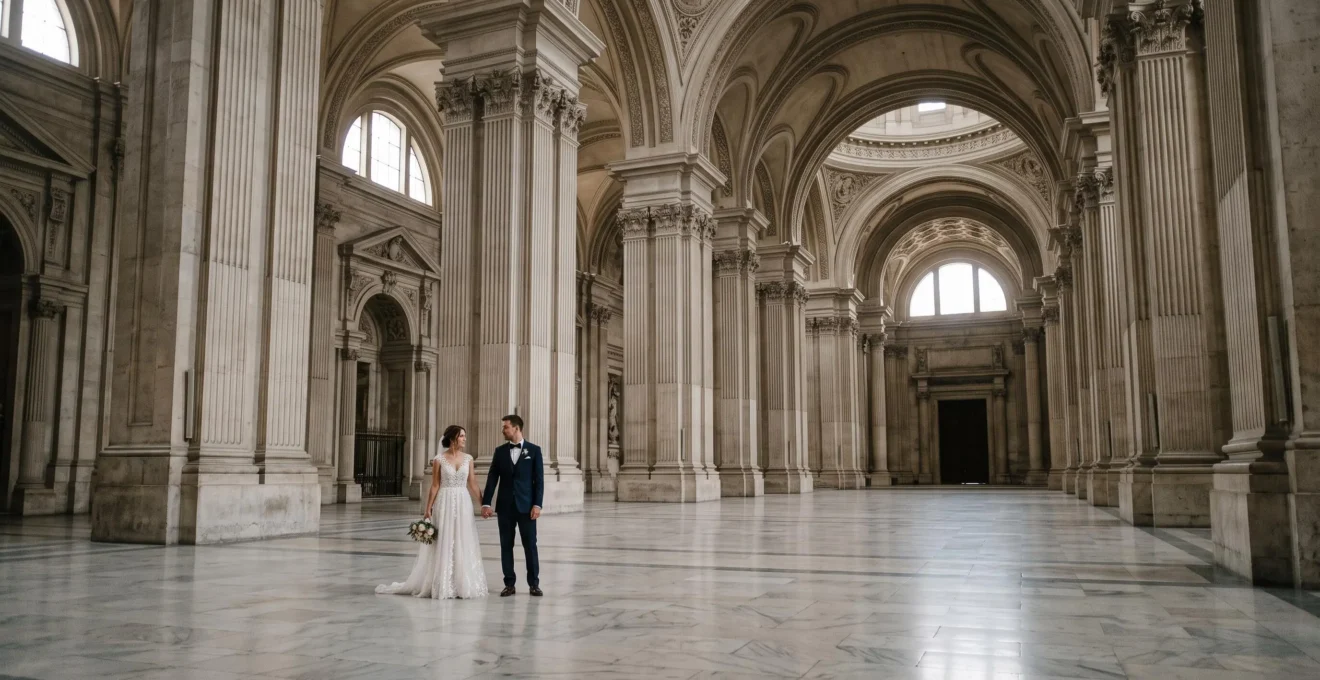
- Use negative space to let architecture breathe, often composing for 60% of the frame to be empty space.
- Position human figures strategically as scale references, not as the dominant subject, to emphasize the venue’s size.
- Control perspective with low angles for verticality or employ tilt-shift techniques to eliminate distortion and preserve true lines.
- Avoid the common mistake of using telephoto compression, which flattens depth and diminishes the sense of scale.
You’ve secured the booking at a breathtaking venue—a historic cathedral, a grand ballroom, or a modern marvel of architecture. The space is immense, awe-inspiring, and promises epic wedding photos. Yet, when you review your images, the result is disappointingly flat. The monumental hall looks merely large, the soaring ceilings feel contained, and the grandeur you witnessed with your own eyes is lost in translation. This is a common frustration for even experienced wedding photographers. The standard advice—use a wide-angle lens or place the couple in the shot—often fails to address the core problem.
The issue isn’t a lack of the right gear; it’s a misunderstanding of visual grammar. Capturing architectural scale is less about what you shoot and more about *how* you direct the viewer’s eye. It involves a deliberate manipulation of space, perspective, and reference points to create a psychological sense of immensity. The couple is not just a subject; they become a unit of measurement. The empty space is not a void; it’s an active element that defines the volume of the architecture around it.
This guide moves beyond the platitudes. It is an architectural photographer’s approach to wedding photography, obsessed with one thing: scale communication. We will dissect why some images convey vastness while others shrink it. We will explore how to use human figures as powerful tools for scale, analyze the impact of camera angles, and reveal the critical mistakes that flatten your images. By understanding these principles, you will stop simply documenting a space and start communicating its soul-stirring grandeur.
This article provides a structured approach to mastering scale. Each section builds on the last, moving from foundational principles of perception to advanced technical execution, ensuring you have a complete toolkit to do justice to any magnificent venue.
Summary: How to Convey Monumental Architectural Scale in Wedding Venue Photography
- Why Some Architectural Photos Convey Grand Scale While Others Make Large Spaces Feel Small
- How to Use Human Figures as Scale References Without Diminishing Architectural Grandeur
- Low Camera Angles or Eye-Level Perspective: Which Better Conveys Vertical Architectural Scale
- The Telephoto Compression Mistake That Flattens Architectural Depth and Scale
- Which Architectural Elements Best Communicate Venue Scale: Ceilings, Staircases or Colonnades
- How to Use 16mm Ultra-Wide Lenses to Capture Venue Scale Without Distorting Architecture
- Converging Perspective Lines or Parallel Symmetrical Lines: Which Creates Stronger Architectural Wedding Portraits
- How to Photograph Wedding Venue Grandeur That Showcases Architectural Scale and Splendour
Why Some Architectural Photos Convey Grand Scale While Others Make Large Spaces Feel Small
The primary reason a photograph of a grand space feels small is a failure to manage negative space. In architectural photography, negative space—the empty area around your subject—is not empty at all. It is the most powerful tool for establishing scale. When a frame is crowded with detail, the eye has no room to breathe and no reference for the vastness. A composition that deliberately embraces large expanses of floor, wall, or sky forces the viewer to acknowledge the sheer volume of the environment. The subject (the couple) becomes the positive space, and its smallness relative to the surroundings tells the story of the venue’s immense size.
As the StudioBinder team notes, this is a fundamental principle: “Scale. Like we mentioned earlier, negative space is great for establishing scale.” The key is to make this space an intentional, dominant element. A rule of thumb is to let negative space occupy roughly 60% of the frame to maximize the impression of grandeur. Plain walls, open floors, or even large swaths of shadow act as a canvas that makes the architectural features and the human subjects within them feel more significant by comparison. By treating the “emptiness” as a subject in its own right, you give the architecture the presence it commands in reality.
How to Use Human Figures as Scale References Without Diminishing Architectural Grandeur
Including a person is the most intuitive way to show scale, but it’s fraught with peril. The moment a human figure becomes the dominant subject, the architecture risks becoming a mere backdrop. The secret is to treat the couple not as the story’s hero, but as a crucial unit of measurement. Their presence should answer the viewer’s subconscious question: “How big is this place?” To do this effectively, the couple must be positioned in a way that emphasizes their smallness relative to their environment. Placing them farther away, silhouetted against a massive window, or at the base of a towering column immediately establishes a visual relationship that screams “scale.”
A perfect illustration of this comes from a photographer’s experience at Portugal’s Mafra Basilica. Faced with its monumental presence, the solution was clear: use people as a reference. As the photographer explains, to judge the size of a church, you should “look at the people watching.” A photograph without this clear reference point leaves the viewer guessing, unable to process the true immensity. The goal is a delicate balance where the architecture quietly frames the intimate moment, allowing the scale of the venue to amplify the significance of the couple’s connection, rather than compete with it. The grandeur becomes part of their story.
Low Camera Angles or Eye-Level Perspective: Which Better Conveys Vertical Architectural Scale
The choice of camera height is a critical decision in the visual grammar of scale. Each perspective tells a different story about the space. A low camera angle, pointing upwards, is the most direct way to communicate verticality and dominance. This perspective forces vertical lines to converge dramatically, exaggerating the height of columns, ceilings, and archways. It places the viewer in a position of awe, looking up at the structure as a child would. This technique is extremely effective for emphasizing soaring ceilings and the imposing nature of a building’s structure. It creates a feeling of being small within a powerful, towering environment.
Conversely, an eye-level perspective offers a more grounded and relatable sense of scale. By shooting from a normal standing height, you place the viewer directly within the scene, creating an experience that feels more authentic and immersive. This perspective excels at communicating depth and horizontal expanse. When you look straight into a long hall or across a wide courtyard from eye-level, the converging lines of the floor and ceiling create a powerful sense of distance. While it may not emphasize vertical height as dramatically as a low angle, it can provide a more accurate and emotionally resonant feeling of the space’s true volume and the experience of standing within it.
The Telephoto Compression Mistake That Flattens Architectural Depth and Scale
One of the most common and misunderstood errors in photographing large venues is the misuse of telephoto lenses. While excellent for portraits, a long lens creates telephoto compression, an optical effect that makes distant objects appear closer together. This effect is the enemy of scale because it actively works to flatten the image and eliminate the sense of depth that is crucial for conveying a venue’s vastness. When you shoot a long hallway or a grand staircase with a telephoto lens, you are visually squashing the space, making the front and back elements appear stacked on top of each other. The feeling of expansive distance is lost.
This isn’t to say telephoto lenses have no place. They can be used creatively to isolate architectural details or create abstract compositions, as seen when focusing on a distant, ornate ceiling pattern with the couple small in the frame below. However, when the primary goal is to communicate the overall scale and volume of a room, a telephoto lens is almost always the wrong tool. It fights against the very perception you are trying to create. To show depth, you need the perspective exaggeration that wider lenses provide, allowing the viewer’s eye to travel through the scene from foreground to background.
Which Architectural Elements Best Communicate Venue Scale: Ceilings, Staircases or Colonnades
Not all architectural elements are created equal when it comes to communicating scale. Certain features are inherently better at providing the visual cues the brain uses to interpret size and volume. Soaring ceilings are perhaps the most powerful communicators of vertical scale. A shot that emphasizes the distance between the floor and the ceiling, especially with an ornate chandelier or detailed truss work as a reference point, immediately creates a sense of grandeur. The feeling of sophistication under high ceilings is a tangible emotional response you can trigger with your composition.
Grand staircases are another exceptional tool. Their repeating, human-sized steps provide a built-in scale reference. A shot looking up a massive, curving staircase or down its entire length tells a story of vertical travel and expansive levels. Similarly, colonnades or a series of arches create a rhythm and recession that masterfully illustrates depth. The repetition of columns marching into the distance is one of the oldest and most effective architectural tricks for creating an illusion of immensity. According to an analysis of space in visual storytelling, different elements carry unique emotional weights: a tall hallway feels cinematic, an imposing facade adds solemnity, and a portrait under an arch feels classic and contained. Focusing on these specific, scale-defining elements will yield far more impactful results than a generic wide shot of the room.
How to Use 16mm Ultra-Wide Lenses to Capture Venue Scale Without Distorting Architecture
Ultra-wide lenses like a 16mm are phenomenal for capturing a huge field of view, but they come with a significant risk: perspective distortion, or “keystoning.” This is the effect where vertical lines, like the sides of a building or columns, appear to converge and fall inwards when you tilt the camera up. While sometimes a creative choice, it often looks like an amateur mistake and misrepresents the architecture’s true form. The professional solution to this is not to avoid wide lenses, but to control the perspective, ideally with a specialized tilt-shift lens.
As fine art photographer Julia Anna Gospodarou explains in her essential guide to the tilt-shift lens, its most important quality “is the fact that it can keep the verticals of a building parallel, thus presenting the object as we see it.” These lenses allow you to shift the optical elements up or down while keeping the camera sensor perfectly level, capturing the top of a building without tilting the camera and introducing distortion.
I shoot with the Nikon Z8 paired with Nikon 24mm and 45mm PC-E lenses, designed specifically for perspective control. These lenses give me the flexibility to capture buildings exactly as they appear to the human eye — with straight verticals and crisp, balanced lines throughout the frame.
– Chris Humphreys, Chris Humphreys Photography
Even without a dedicated tilt-shift lens, you can apply the principle. By shooting level from a greater distance and cropping later, or by using software-based perspective correction tools, you can mitigate the worst of the distortion. The key is to be aware of your vertical lines and strive to keep them parallel to the edges of your frame for a clean, professional, and accurate representation of the venue’s scale.
Your Action Plan: The Shift Technique for Distortion-Free Verticals
- Level the Camera: Position your camera so the body is perfectly level, pointing straight at the architectural subject. Do not tilt it up or down.
- Shift the Lens: If using a tilt-shift lens, shift the lens upward (if shooting a tall structure from below) or downward (if shooting from above). Continue shifting until the building’s vertical lines appear parallel to the edges of your viewfinder.
- Compose and Capture: By shifting the lens, you effectively raise the image’s optical center. This allows you to include the full height of the building in your frame while maintaining perfectly parallel vertical lines, capturing its true scale without the distracting keystoning effect.
Converging Perspective Lines or Parallel Symmetrical Lines: Which Creates Stronger Architectural Wedding Portraits
The choice between using dynamic converging lines and stable parallel lines is a fundamental compositional decision that dictates the energy of your portrait. Converging lines, which naturally occur when you point a standard lens up at a tall structure, create a powerful sense of dynamism, depth, and drama. This effect, known as keystoning, draws the viewer’s eye rapidly towards a vanishing point, creating an energetic and sometimes unsettling feeling of towering scale. For a dramatic, cinematic wedding portrait, intentionally using these converging lines can be a highly effective tool.
On the other hand, compositions built on parallel symmetrical lines evoke a completely different feeling. By using perspective control techniques (like a tilt-shift lens or careful post-processing) to keep vertical lines perfectly straight and parallel, you create an image that feels balanced, calm, and timeless. This approach honors the architect’s original design and produces a sense of order and serenity. Symmetrical framing, such as placing a couple beneath a perfect arch, can feel classic and contained, creating a pocket of intimacy within a grand space. The straight lines provide a sense of stability and formal elegance that is often perfectly suited to the gravitas of a wedding day.
Key takeaways
- The perception of scale is psychological; your job is to provide the visual cues the brain needs to feel a space’s size.
- Embrace negative space as an active compositional element, letting it define the volume of the architecture.
- Always use a wider lens than you think you need for conveying depth, and master perspective control to avoid distortion.
How to Photograph Wedding Venue Grandeur That Showcases Architectural Scale and Splendour
Ultimately, photographing a venue’s grandeur is about synthesis. It’s about combining the principles of scale, perspective, and composition into a cohesive vision. You are not just an architectural photographer, nor are you just a portrait photographer. On a wedding day in a magnificent venue, you must be both. Your technical understanding of how to communicate scale must serve the ultimate goal: telling the human story of the couple. The grandeur of the venue is not the subject; it is the stage, and its epic proportions should serve to elevate the importance and intimacy of the moment.
As one photographer noted when shooting in vast Los Angeles warehouse venues, the architecture introduces a sense of scale that can make the intimacy feel even more meaningful. This is the pinnacle of this craft. When you can place a small, intimate moment—a shared glance, a gentle touch—within a composition that successfully communicates the monumental scale of the surroundings, you create an image with profound emotional resonance. The vastness of the space doesn’t diminish the couple; it highlights their connection as a singular, important event within a grand, timeless setting.
This mastery transforms your work from simple documentation into powerful storytelling. You are no longer just showing a couple in a big room. You are using the visual language of architecture to make a statement about their love story: that it is a moment of profound significance, worthy of the magnificent stage on which it unfolds.
Now that you understand the visual grammar of scale, the next step is to consciously apply these techniques at your next wedding. Begin by identifying the key architectural elements of the venue and pre-visualize the shots that will best communicate its unique grandeur.