
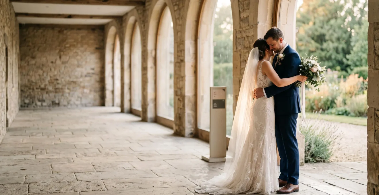
The Rule of Thirds is not a rigid grid for subject placement; it’s a principle for creating visual tension and telling a more compelling story.
- Off-center compositions are scientifically perceived as more dynamic because they guide the eye and create narrative space.
- Learning to identify natural lines in architecture and landscapes allows you to apply the principle intuitively, without relying on a camera grid.
Recommendation: Instead of defaulting to centered compositions, consciously decide when to use symmetry for impact and when to use the Rule of Thirds to add energy and emotional weight to your images.
You’ve captured a beautiful moment—the light is perfect, the couple is radiant—but when you review the image, it feels… flat. It’s a technically sound photograph, but it lacks the dynamism and emotional punch you felt in the moment. This is a common frustration for photographers who instinctively place their subjects dead-center in the frame, creating balanced but ultimately static compositions that fail to hold the viewer’s attention.
The standard advice is always the same: “Use the Rule of Thirds.” You’re told to turn on your camera’s grid overlay and place important elements along the lines or at their intersections. While this is a functional starting point, it treats a fundamental principle of art as a rigid, mechanical formula. This approach often leads to images that are just as generic as their centered counterparts, simply offset to the side.
But what if the true power of the Rule of Thirds isn’t about the grid at all? What if it’s a principle of perception, a way of seeing and manipulating visual tension and narrative space to tell a story? The goal isn’t to mechanically follow a rule, but to develop an intuitive understanding of why off-center compositions feel more alive. It’s about moving from a checklist mentality to one of conscious, intentional artistry.
This guide will deconstruct the Rule of Thirds, moving beyond the simple grid. We will explore the psychological reasons it creates dynamism, show you how to find natural compositional lines in any venue, and discuss when to embrace the rule for energy—and, crucially, when to break it for maximum impact.
This article provides a complete framework for moving beyond default compositions. Explore the sections below to master the principles that will elevate your wedding photography.
Summary: From Formulaic to Fine Art: A Guide to Composition
- Why Rule of Thirds Compositions Feel More Dynamic Than Centered Symmetrical Wedding Portraits
- How to Identify Natural Rule of Thirds Gridlines in Unpredictable Wedding Venue Architecture
- Horizontal or Vertical Framing: Which Orientation Enhances Rule of Thirds in Full-Length Couple Portraits
- The Formulaic Mistake of Applying Rule of Thirds to Every Image Including Symmetrical Moments
- When to Sacrifice Perfect Rule of Thirds Composition to Capture Fleeting Unrepeatable Moments
- Why Leading Lines Make Viewers Look Exactly Where You Intend in Busy Wedding Group Photos
- Tiny Subject in Vast Space or Balanced Proportions: Which Minimalist Approach Suits Emotional Wedding Moments
- How to Use Architectural Leading Lines to Guide Viewer Attention in Wedding Venue Photography
Why Rule of Thirds Compositions Feel More Dynamic Than Centered Symmetrical Wedding Portraits
The reason off-center compositions feel more engaging isn’t arbitrary; it’s rooted in how our brains process visual information. A centered subject creates perfect symmetry and balance. It’s stable, calm, and conclusive. There is nowhere else for the eye to go. An image composed using the Rule of Thirds, however, introduces visual tension. By placing a subject off-center, you create an imbalance that the viewer’s eye instinctively wants to explore, moving through the frame to understand the relationship between the subject and the surrounding space.
This psychological effect is more than just a theory. A peer-reviewed study in the journal *Art & Perception* found that the viewer’s engagement is measurably different with off-center subjects. The research confirms that images following the rule are subjectively rated as more dynamic, as the composition encourages the eye to travel. According to the study, there is a moderate correlation between the rule’s application and how dynamic an image feels, confirming that subjective ratings of dynamism and balance are influenced by this specific compositional choice.
This creates a subtle narrative. Where a centered portrait is a statement (“Here is the subject”), an off-center portrait asks a question (“What is the subject looking at? Where are they going?”). As fine art photographer Diane Wehr notes, this compositional choice leverages a learned visual language. In her analysis, she explains:
The Rule of Thirds is a visual pattern that we associate with activity.
– Diane Wehr, Diane Wehr Street Photography Blog
By moving your subject away from the center, you are not just balancing elements; you are infusing the static image with a sense of potential movement and life. You are transitioning from a passive portrait to an active scene, which is fundamentally more interesting and dynamic for the human brain to process.
How to Identify Natural Rule of Thirds Gridlines in Unpredictable Wedding Venue Architecture
The most significant leap in compositional skill comes when you stop relying on your camera’s grid overlay and start seeing the inherent grids within the environment itself. Wedding venues, from rustic barns to grand ballrooms, are filled with natural lines that you can use to structure your shots. Doorways, window frames, rows of chairs, beams on a ceiling, or the edge of a shadow can all serve as the powerful lines of a Rule of Thirds grid.
The key is to train your eye to look for structure instead of just a backdrop. A tall doorway can act as a vertical line, a long table can be a horizontal line, and the convergence of walls can create a natural intersection point. By placing your subjects in relation to these existing architectural features, your composition will feel both intentional and organic, as if the scene was naturally built for that perfect shot.
This image demonstrates how a simple shaft of light and its corresponding shadow can create a powerful compositional grid within an otherwise minimalist space. The light acts as a strong diagonal, guiding the eye, while the interplay of light and dark naturally divides the frame into compelling sections.
Learning to spot these opportunities quickly is a skill that separates amateurs from professionals, especially during a fast-paced wedding day. Instead of trying to force a perfect grid onto every scene, look for the dominant lines the environment gives you and work with them. This approach makes your compositions stronger and your workflow faster.
Action Plan: Finding Natural Grids on a Hectic Wedding Day
- Break the Center Habit: Start by consciously placing your subject anywhere but the dead center. Even an approximate placement in a corner or lower portion of the frame immediately adds visual interest.
- Scan for Directional Lines: Before you shoot, quickly scan the entire scene—from floor to ceiling—for any group of lines running in the same direction. Aisle runners, ceiling beams, or rows of pews are perfect natural guides.
- Use the Aisle’s Power: Treat the central aisle during a ceremony as a powerful set of converging leading lines. Position the couple or a key moment at its vanishing point for maximum compositional impact.
- Prioritize Focus When Time Is Short: If a moment is too fleeting to nail the perfect grid alignment, forget the grid. Instead, shoot with a wide aperture to isolate your subject through a shallow depth of field; a blurred background can be just as effective as a perfect composition.
Horizontal or Vertical Framing: Which Orientation Enhances Rule of Thirds in Full-Length Couple Portraits
The choice between a horizontal (landscape) and vertical (portrait) orientation is more than a practical matter of fitting the subject in the frame; it’s a decision that fundamentally alters the feel of the composition and the function of the Rule of Thirds. Neither is inherently better, but each serves a different narrative purpose by manipulating the narrative space around the couple.
A vertical orientation is naturally suited to the human form and is excellent for full-length portraits of a single person or a closely embraced couple. When you apply the Rule of Thirds here, placing the couple on one of the vertical lines, you emphasize their stature and create “breathing room” on the other side. This negative space can suggest a path forward or a view they are sharing, adding a subtle layer of story to an otherwise simple portrait.
A horizontal orientation, by contrast, is ideal for incorporating the environment and telling a broader story. Placing a couple on one side of a wide, horizontal frame leaves a vast amount of negative space. This space isn’t empty; it’s filled with context—the sweeping landscape, the grandeur of the venue, or the sunset. This gives the couple a world to exist in, transforming them from the sole subject into characters within a scene. As the Creative Market blog notes, this space is crucial for balance:
This gives the subject more white or negative space around him or her, thereby working as breathing room in the frame.
– Creative Market Editorial Team, How to Use the Rule of Thirds for Stunning Photography
The best photographers often switch between orientations for the same scene. A vertical shot might capture the intimacy of the couple, while an immediate switch to a horizontal frame captures that same intimacy within the epic context of their wedding day. This decision should always be driven by your compositional intent: are you emphasizing the couple, or the couple within their world?
The Formulaic Mistake of Applying Rule of Thirds to Every Image Including Symmetrical Moments
The most common mistake a photographer can make after learning the Rule of Thirds is to treat it as an unbreakable law. The truth is, some of the most powerful and elegant compositions are perfectly, unapologetically centered. The key is to develop compositional intent—the ability to know *why* you are choosing a particular composition for a specific emotional effect. Applying the Rule of Thirds by default is just as formulaic as centering everything by default.
Symmetry is a powerful tool for conveying feelings of stability, peace, formality, and timelessness. When you encounter a scene with strong symmetrical elements—such as a grand architectural archway, a long, straight aisle, or a perfect reflection in water—breaking that symmetry is often a mistake. Centering your couple in such a frame leverages the natural power of the environment, creating an image that feels deliberate, balanced, and profoundly elegant.
A centered composition forces a direct confrontation with the subject. There is no visual journey; the viewer’s eye lands directly on the subject and stays there. This can be incredibly effective for intense, emotional portraits where you want the focus to be solely on the couple’s connection, without any compositional distractions.
Case Study: Breaking the Rule for a Stronger Image
In various guides, outlets like Digital Photography School have documented numerous instances where photographers achieve more powerful results by deliberately breaking the Rule of Thirds. An analysis of landscape and architectural photography shows that when a scene presents intense natural symmetry, such as a perfect reflection in a still lake or the converging lines of a cathedral aisle, centering the subject is often the superior choice. As one guide on composition notes, while this technically violates the rule, the resulting images are described as more eye-catching and impactful. This reinforces a critical lesson: when the environment offers powerful symmetry, using it creates a stronger statement than forcing an off-center composition.
The decision to center or not should be a conscious choice. Ask yourself: what does this scene offer? Does it offer balance and symmetry, suggesting a centered composition? Or does it offer tension and narrative space, suggesting an off-center one? The master photographer knows when to follow the rule, and more importantly, when to break it.
When to Sacrifice Perfect Rule of Thirds Composition to Capture Fleeting Unrepeatable Moments
On a wedding day, a perfect composition is a luxury, but a captured moment is a necessity. There are countless unscripted, unrepeatable moments—a tear during the vows, a burst of laughter, a child’s spontaneous hug—that happen in a fraction of a second. In these moments, the relentless pursuit of a technically perfect Rule of Thirds composition is not just impractical; it’s a liability that can cost you the shot entirely.
Your primary role as a wedding photographer is that of a documentarian. You are there to capture the story and the emotion of the day as it unfolds. If you are so preoccupied with aligning a subject perfectly on a grid intersection that you miss the peak of the emotional expression, you have failed in your most important task. Emotion always trumps technical perfection. An imperfectly composed photo that is bursting with genuine emotion is infinitely more valuable than a perfectly composed photo that feels sterile and lifeless.
This is where a “shoot wide, crop later” mentality can be a lifesaver. Instead of trying to nail the perfect framing in-camera during a chaotic moment, give yourself some breathing room in the frame. Shooting slightly wider than you think you need to ensures you capture the entire moment. You can always crop in post-production to refine the composition, but you can never re-create a moment that you missed because you were fumbling with your framing.
Ultimately, compositional rules are tools to be used, not masters to be served. When faced with a choice between capturing a fleeting, authentic moment and achieving a perfect composition, always choose the moment. Your clients will treasure the memory of a genuine laugh far more than they will ever notice or appreciate a perfectly placed grid line. The documentation of unscripted, imperfect moments is where the real magic of wedding photography lies, and that is a goal worth sacrificing any rule for.
Why Leading Lines Make Viewers Look Exactly Where You Intend in Busy Wedding Group Photos
While the Rule of Thirds creates balance and dynamism, leading lines offer something more direct: control. In a busy or chaotic scene, like a large group photo or a crowded reception, leading lines are the most powerful tool you have to command the viewer’s attention and guide it to a specific point. They act as visual pathways, cutting through the clutter and telling the eye exactly where to look. As the editorial team at PetaPixel succinctly puts it, their function is clear.
A leading line is a line in a composition that guides the viewer’s eyes from one part of the picture to another.
– PetaPixel Editorial Team, Leading Lines in Photography: A Complete Guide
These lines can be literal, like a road, a fence, or a church aisle, or they can be implied, such as the direction of a person’s gaze, a row of guests turning to watch the couple, or an arm extended for a handshake. In wedding photography, you are constantly surrounded by them. The key is to recognize them and use them to your advantage. For a group photo, instead of a static line-up, you can arrange guests along a curving path or a diagonal staircase, using their own formation as a line that leads to the couple.
The most effective use of leading lines involves placing your key subject—the couple—at the very end of the strongest line in the frame. This creates a sense of arrival and makes the subject the undeniable focal point. For example, by positioning yourself so that a long, decorated banquet table appears to point directly at the laughing couple, you use the environment to reinforce their importance. This technique is invaluable for adding order and a clear narrative to images that could otherwise feel messy and overwhelming.
When you master the use of leading lines, you are no longer just a passive observer of the scene; you become a visual director. You have the power to organize chaos, eliminate distractions, and ensure that the most important element of your photograph—the human story—is what the viewer sees first.
Key Takeaways
- Compositional rules are guides, not laws. Your primary goal is to capture emotion; technical perfection is secondary.
- Symmetry is a powerful tool. Use it intentionally for balanced, elegant shots, especially when architecture provides it.
- Look for natural lines in the environment (architecture, light, landscape) to create compositions that feel organic and intentional.
Tiny Subject in Vast Space or Balanced Proportions: Which Minimalist Approach Suits Emotional Wedding Moments
Minimalism in wedding photography isn’t about emptiness; it’s about distillation. It’s the art of removing distractions to amplify emotion. Two powerful, yet opposing, minimalist approaches you can use are manipulating scale: making the subject tiny in a vast space, or zooming in for an intimately balanced frame. The choice between them depends entirely on the specific emotion you want to evoke.
Placing a couple as a tiny silhouette against an immense landscape or a vast, open sky is a technique used to evoke feelings of awe, destiny, and grandeur. The vast negative space that dwarfs the couple doesn’t diminish them; it gives their presence a profound emotional weight. This approach is perfect for establishing shots of the venue, recessional photos, or quiet moments where you want to communicate the scale of their journey together. As the editorial team at Stelava beautifully states, this contrast has a powerful effect:
The subject, dwarfed by expansiveness, gains emotional weight.
– Stelava Editorial Team, Small Subject, Big Impact: 4 Creative Uses of Scale in Photography
The opposite approach—a tightly framed, close-up shot—is used to evoke intimacy, connection, and vulnerability. By filling the frame with small details like clasped hands, a wisp of hair, or a single tear, you invite the viewer into the couple’s personal space. Here, the environment is completely removed, and the entire universe of the photograph becomes the emotion shared between two people. This is ideal for the first look, the vow exchange, or the first dance.
This image masterfully contrasts the feeling of a tiny couple against a vast landscape with the implied intimacy of a close, personal moment. It visually represents the two ends of the emotional spectrum you can capture through scale.
A complete wedding gallery should rhythmically alternate between these grand-scale and tight-intimate shots. This contrast builds a richer, more complete narrative of the day, capturing both the epic scope of the event and the quiet, personal emotions at its heart.
How to Use Architectural Leading Lines to Guide Viewer Attention in Wedding Venue Photography
Once you begin to see a wedding venue not as a mere backdrop but as a collection of compositional tools, your photography will transform. The architecture itself—its hallways, staircases, windows, and arches—is rich with leading lines that you can leverage to add depth, energy, and a clear focal point to your images. The final step in mastering composition is to learn how to read this architectural language and use it with intent.
Not all lines are created equal. Each type carries its own emotional subtext, and choosing the right one can dramatically enhance the story you’re telling. The most common types you’ll encounter are:
- Straight Lines: Found in hallways, aisles, railings, and columns. They convey a sense of order, stability, and directness. Use them to guide the viewer’s eye in a confident, straightforward manner directly to the couple.
- Curved Lines: Found in spiral staircases, winding paths, or arched doorways. They add a sense of grace, elegance, and movement, leading the eye on a more gentle and meandering journey through the frame.
- Diagonal Lines: Created by stairs, slanted roofs, or even dynamic shadows. They imply action, energy, and tension. These are best used for dynamic, candid moments rather than static, posed portraits.
Often, especially in ornate venues, these lines compete for attention. Your job is to identify which line is the most effective narrator. The best choice is almost always the one that actually terminates at or near your subject. A beautiful, grand staircase that leads the eye to an empty corner is a compositional failure. A simple, subtle line created by the edge of a carpet that points directly to the couple is a compositional success.
By consciously selecting which architectural lines to incorporate, you are collaborating with the venue itself to craft a more powerful image. You are moving beyond simply placing a couple in a pretty location and are now actively using that location’s structure to direct attention, create mood, and tell a more compelling story.
Start today by looking at every venue as a compositional partner. Identify its dominant lines and consciously decide how to use them to guide the viewer’s eye and elevate your storytelling from simple documentation to fine art.